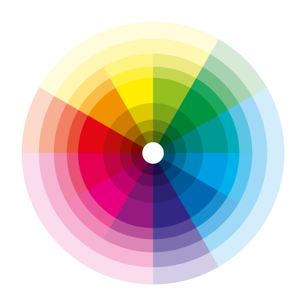
What feelings should people have when they see your company's or personal logo? How can it evoke that same feeling every time? Colour is often not the first thing a designer thinks of.
Here is an introduction to using colour psychology in logo design.
Four important reasons why colour matters in design:
- Instant impact: Colour evokes feelings or messages almost instantly. It is one of the strongest forms of nonverbal communication.
- Our minds are already programmed: We go when the light turns green, avoid food with an unappealing colour and stop for flashing red lights behind us. Colour plays a role in every moment of daily life.
- Colours vary across cultures: Colours mean different things in different countries and cultures, so we need to understand what viewers will take from them.
- Colour matters in every area of life: Colour can suppress appetite, make people hungry, sad or happy, and even give them a sense of power.
42 Common Emotions and the Colours Associated with Them
Do you know how to evoke the feeling you want? This quick reference can help you create a stronger logo expressing the right emotion.
- Action and adventure? Red
- Affordability? Orange
- Aggression? Red
- Appreciation — Pink
- Attention? Red, yellow
- Authority? Black, blue, purple
- Calm? Blue, brown, pink, green
- Attention? Yellow
- Trust? Blue
- Creativity? Orange
- Curiosity? Yellow
- Dignity? Blue
- Drive and energy? Orange, red
- Enthusiasm? Orange
- Femininity? Pink, purple
- Fun? Orange
- Gentleness? Pink
- Gratitude? Pink
- High spirits? Orange
- Happiness? Pink, yellow, red
- Harmony — Green
- Health and healing — Green
- Innocence? Pink
- Love? Red, pink
- Luxury and prosperity? Purple, green
- Mystery? Purple, black
- Nature? Green, brown
- Passion? Red
- Positivity? Yellow
- Playfulness? Yellow, pink
- Romance? Pink, purple
- Privilege? Purple
- Simplicity? Brown, black, white
- Sophistication? Purple
- Spirituality? Purple
- Strength? Red
- Success? Blue
- Tradition? Black
- Calm? Pink, green, blue, white
- Reliability? Blue
- Warmth? Yellow
- Youth? Pink, orange
10 Common Colours and Their Meanings
Looking at this in reverse, we can check whether an existing logo conveys the right feeling. Below are popular colours and their common meanings in logo design.
- Brown — Represents nature and woodland. Its simple, neutral character often appears in legal and construction logos.
- White — A universal symbol of peace, representing simplicity, purity, sterility and brightness.
- Purple — Often used in luxury and education logos. Combining warm and cool qualities, it suggests culture, royalty and mystery. It is uncommon, and many designers hesitate to use it.
- Blue — Blue often conveys authority and security. Used in medicine, government and Fortune 500 companies, it is especially popular for its associations with dignity and loyalty.
- Green — Often represents renewal and life. It can evoke calm and peace, but also jealousy and inexperience. It is common in environmentally friendly company logos.
- Yellow — This colour can be ambiguous, suggesting caution, cowardice or happiness. It is often used to attract attention and convey warmth, but can also dominate and tire the eyes.
- Orange — Combines red and yellow to create playfulness and stimulate appetite. It highlights cheerfulness and energy in a logo.
- Red — Red is an intense, frequently used attention-getter. It can suggest hunger and increased breathing or blood pressure. Its associations with power, aggression, vitality and especially love make it common in logos.
- Pink — Conveys innocence, fun, playfulness and delicacy, often adding a feminine quality. Its calming effect makes it common in health, cosmetics and relationship-focused logos.
- Black — Technically the absence of colour, black conveys strength and authority. It often represents elegance, tradition and simplicity and appears in almost every type of logo.


